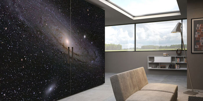
The 5 Secrets to Pulling Off Simple, Minimal Design

The 5 Secrets to Pulling Off Simple, Minimal Design
In a world that often feels cluttered and overwhelming, the beauty of simple, minimal design stands out as a breath of fresh air. Minimalism is not just an aesthetic; it represents a lifestyle that values less over more, clarity over chaos. Whether you’re designing a room, creating a website, or developing a brand, mastering minimal design principles can elevate your work significantly. Here are the five secrets to pulling off simple, minimal design successfully.
1. Embrace the Power of White Space
White space—also known as negative space—refers to the empty areas around elements in your design. It’s often mistaken for wasted space, but in reality, it’s one of the most powerful tools for achieving minimal design. White space enhances readability, draws attention to key elements, and creates a sense of balance.
When incorporating white space into your design, aim to create areas of calm between text, images, and graphics. This approach not only makes your design look cleaner and more organized, but it also allows users to digest information more easily, making their experience more enjoyable.
2. Choose a Limited Color Palette
Color choices can make or break a design. In minimal design, less is undeniably more. A limited color palette reduces visual clutter and enhances harmony. Typically, minimal designs utilize two to four colors, including neutral tones. Consider using shades of white, gray, black, or muted tones for a sophisticated look.
When selecting colors, think about the emotional impact and message they convey. For instance, blue evokes trust and calmness, while red can represent energy and passion. Select hues that align with your brand or project objectives, sticking to a cohesive palette to maintain simplicity.
3. Focus on Functionality
In minimal design, functionality is key. Every element should serve a purpose and contribute to the overall goal of your project. This principle is especially vital in user experience (UX) design, where functionality influences how users interact with your product.
When designing, ask yourself if an element is necessary. If it doesn’t add value or contribute to your design’s objective, it’s best to leave it out. A clean, functional approach will make your design more intuitive and user-friendly.
4. Use Strong Typography
Typography is an essential component of minimal design. Clean, legible fonts not only communicate your message effectively, but they also add visual interest without overwhelming the reader. Opt for a limited number of typefaces—ideally one or two—and use different weights and sizes to create hierarchy within your text.
When selecting your font, consider both its aesthetic qualities and its readability. Sans-serif fonts are often favored in minimal design for their clean lines and modern appeal. Experiment with letter spacing and line height to ensure your typography feels balanced and harmonious within your overall design.
5. Keep It Authentic
At its core, minimal design is about authenticity and intentionality. Strive to be genuine in your design choices—this means being true to your brand’s values and the message you want to convey.
Avoid following design trends that don’t resonate with your vision or may lead you away from simplicity. Instead, develop a unique style that reflects your personality or the essence of your brand. Authenticity will shine through every aspect of your design and create a lasting impact on your audience.
Conclusion
Pulling off simple, minimal design may seem challenging at first, but by focusing on white space, a limited color palette, functionality, typography, and authenticity, you can create designs that are not only aesthetically pleasing but also meaningful. Minimalism allows for clarity, intention, and a connection to the essentials. So, take these secrets to heart, and let your creativity play within the realm of simplicity. The results will speak for themselves—a fresh, impactful design that resonates with audiences and stands the test of time.

0 comments